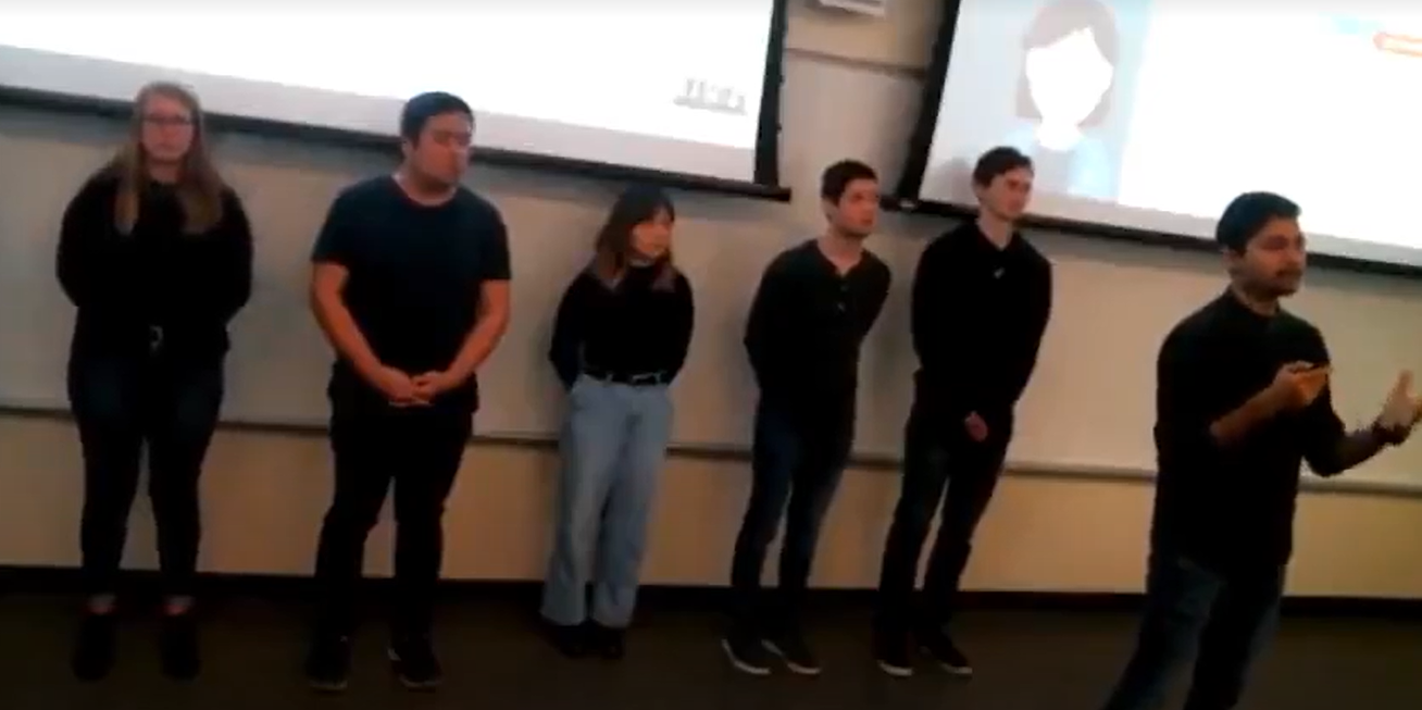
Customer Journey For ABB's Energy Management System.
OPTIMAX® is a Renewable Energy Management System by ABB which optimizes energy usage autonomously eliminating need of manual data entry and control.
The Challenge
With the increase in renewable energy usage in industries, ABB required an online customer journey for OPTIMAX® so that they could reach out to smaller and mid sized companies who aren't their primary customers without needing to increase size of their sales team.
We were tasked to understand needs and wants of these smaller companies, design and deliver a polished solution in form of a website and research insights.
Company: ABB
Duration : 12 Weeks
Role : UX Designer
My Role
In the Fall 2019 semester, I was part of a six person team (all undergrad UX Design Students) working for a project sponsored by ABB. We worked closely with our sponsor Chris Naunheimer (Product Portfolio Curator at ABB) who is based in Chicago area.
My role was to contribute in the project throughout the design process as a UX Designer putting to use my design skills and experience I have gained through previous projects. Through the process I led several sponsor meetings, interviews etc. Besides leading the final design sprint, I took over the testing of our design as I selected or created the testing methods we used to test our design. I created the weather animation interactivity which is one of distinguishing features of the journey and it was my idea. Through the design process, I collaborated with my teammates and also took some of leadership role on an interpersonal level.
Final Deliverables
A website mock-up
User Research Report
User Journey Map
Documentation
The Solution
Empowering the User
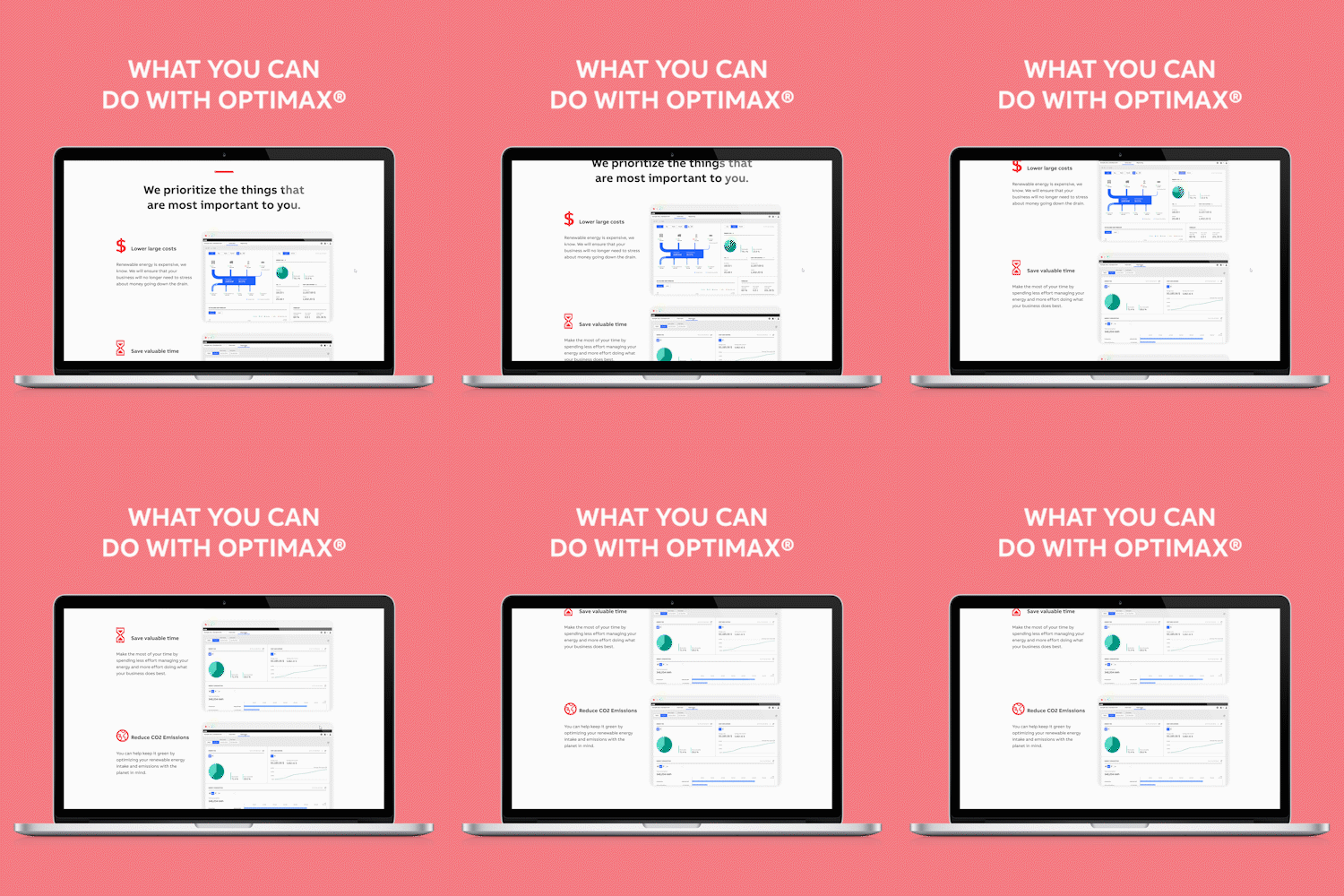
Our project sponsors at ABB challenged us to focus on empowering the user instead of creating a common product centered page which talked about the product and it's features.
Based off our research, which is discussed later, we prioritized presentable information, and made the user the focus of the page instead of the product.
Interactive Elements
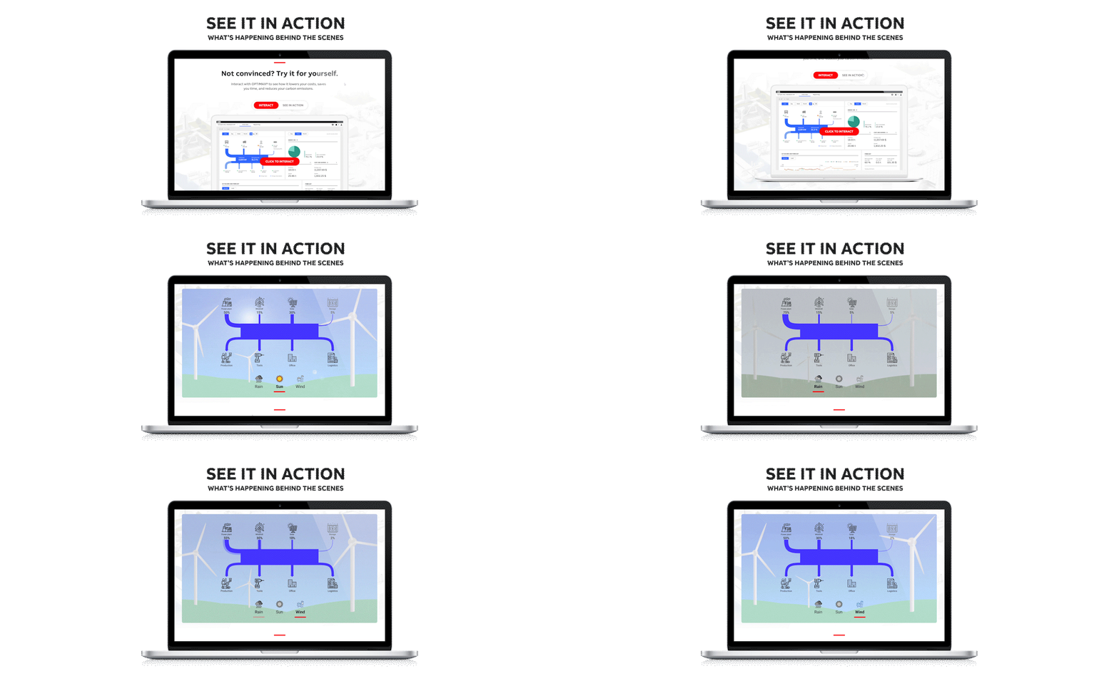
The competing or comparable product journeys provide the user with a chance to interact with the software. To set ABB apart and to increase interest from customers, they challenged us to imagine some unique interactive elements.
I created an interactive animation to provide the users with context on what the software is doing for the user. The animation shows how the software optimizes energy resources and usage based on the weather conditions. This provides the users with a sense of automation and helps them visualize the product in action in a real world context.
Narrative Elements
The idea of the customer journey was to create put the user as the hero of the story not the product while making the user more convinced about buying the product.
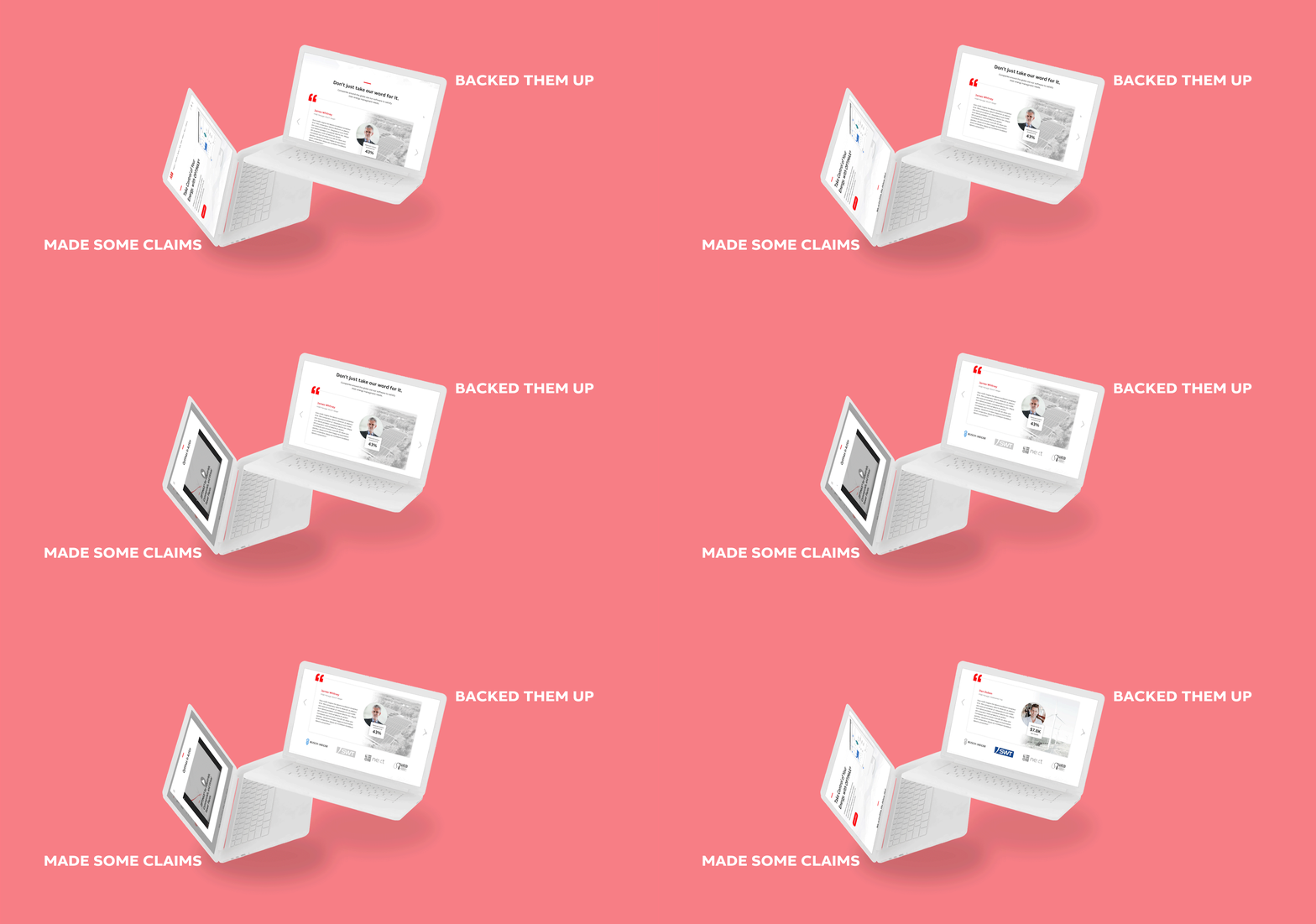
We decided to create a hero section at the top of the site which makes claims on how the user would benefit, and close to the end of the site, we placed customer testimonials to back those claims up. Our research insights led us into making this decision.
The Research Phase
Interviews and More
We started off our project broad so we looked into what makes a good customer journey, what are some do's and don't for them, etc. We did a competitive analysis of ABB's immediate competitors like Honeywell, Emerson, Siemens and Schneider, etc. We recognized a need for a good story, customer success stories and a balance between visuals and text.
Upon gaining clarification on our project scope from our sponsor, we decided to start interview process for our project.
We interviewed 2 business people who are in roles which entail energy management for organization. And, we interviewed 3 people from ABB to get a better idea on what the product we're working with is and get a better understanding of the problem scope.
I conducted part of the competitive analysis and conducted one of the interviews while I also lead communication with sponsor regarding clarification on our project scope.
Analysis
After finishing our interviews and research looking into what documentation ABB sent us and their Figma prototype, we started analyzing our research.
We created a persona, Linda ,who is a potential customer for ABB. We created the persona based on our research findings from the interviews we had conducted.
We used our persona to create an experience map. We mapped out experience through 'realization of need', 'searching for solutions', 'decision making' and 'purchase' . We realized our project scope will allow us to work with the searching and decision making phase.
We created power summaries summarizing interviews and understood what features are important for the user and what are their end goals. We understood that videos and interactive touch points led to an engaging experience.
I led efforts creating the experience map and made sure we did not fall into any confirmation biases.


The Design Phase
Wireframes and Feedback
Based off our understanding of what the website should have, we started off on ideation and came up with a basic idea of the content to be present on the website. We conducted some team ideation activities to decide on how sections of the website should be presenting the information.
Upon presenting to our sponsor we were told to "make the user the hero of the story". With the feedback we decided do a comparative analysis of more user centered project management systems like Trello, monday.com, Basecamp, etc. We also used findings from this to create mood boards for sections for our site.
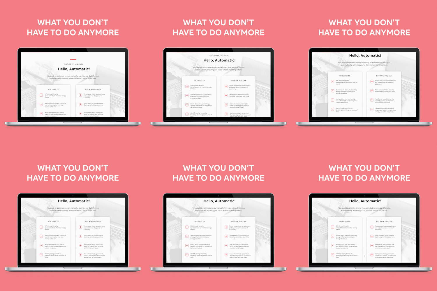
We found that the language plays a major role in making the user the "hero" of the story. We decided to move forward with our design and add "You" language in Med and Hi-Fi.
For the ideation, I came up with the idea for a weather toggle interactivity showing how the software optimizes energy which later becomes a distinguishing factor of our solution.
Shown below: Activity we conducted to understand what goes into making the user the hero of the story and how we could use it in our case.

Round 1 Testing: Sequence of Content
The first goal of our testing was to understand what would be the ideal arrangement of the sections of our website. What arrangement tells a story and is able to create a narrative using the visual hierarchy.
I created a testing method for the purpose based off card sorting. I called it "Arrange-Rearrange" in which the users would be given cut out sections of the website and asked to arrange them vertically in whatever way it made sense to them followed by telling us their rationale. We provided the users with wireframes level sections with it's name written on the back. We encouraged our participants to rely on the visuals and only flip the cards to see their names if needed. I conducted the test with four participants as the test facilitator.
We got some interesting insights from the test and it helped us reach to an information hierarchy which made sense to most users.


Med-Fi & Testing Round 2
Upon completing our first round of testing, we had a better idea of where were moving forward towards. Using the mood boards we had created earlier, we created medium fidelity mock-ups in Figma and decided to test again.
The goal of this round of testing was to understand if the visuals we had created allowed the important information to stand out to the users and if the users are able to make sense of the whole website.
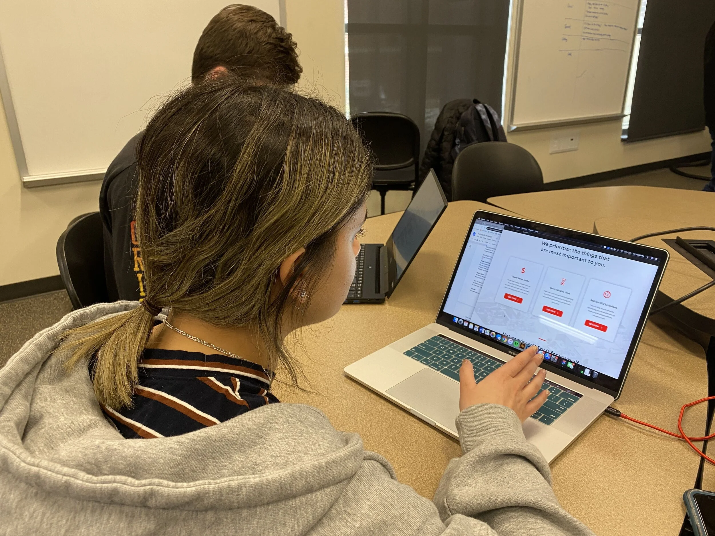
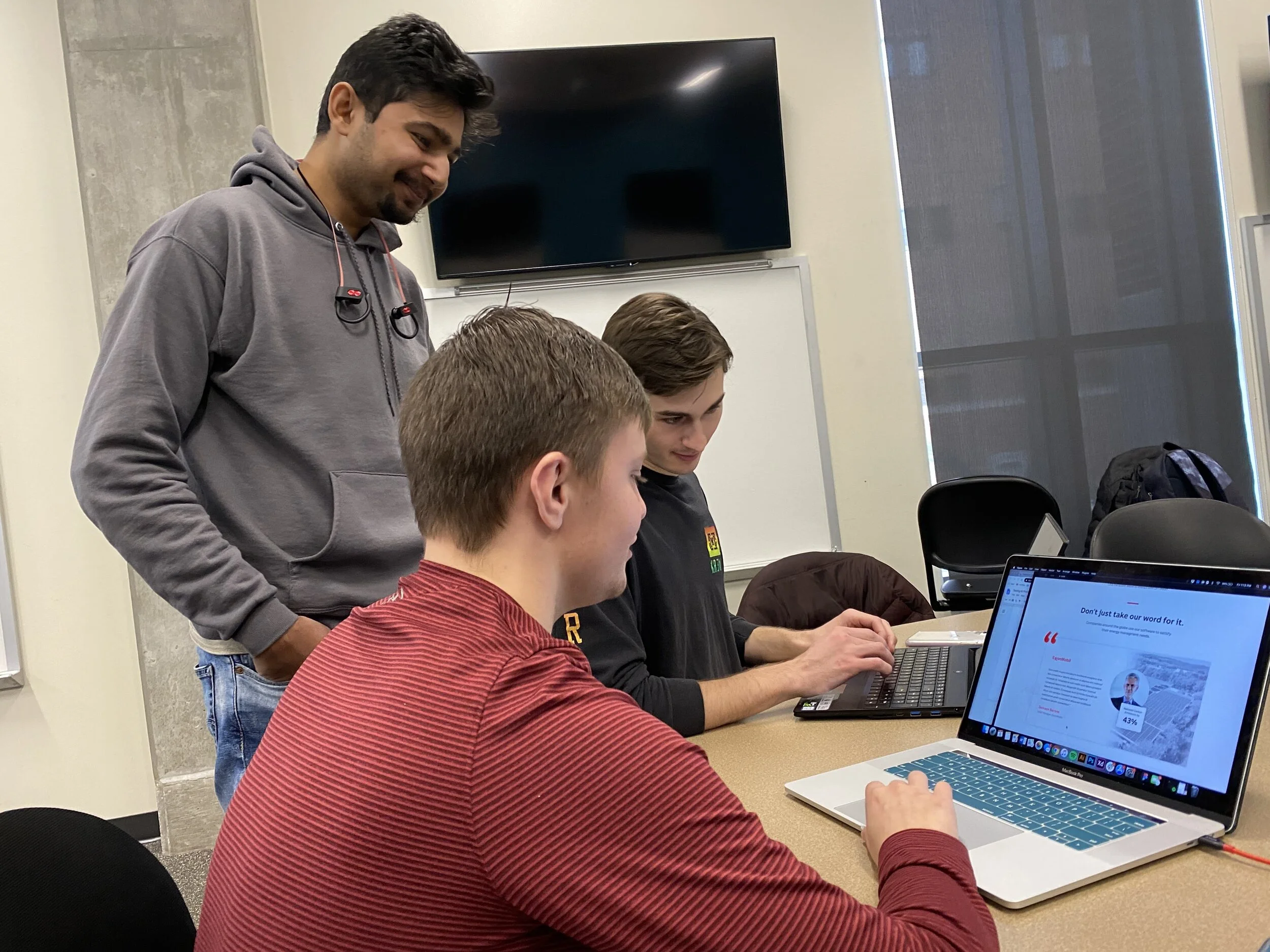
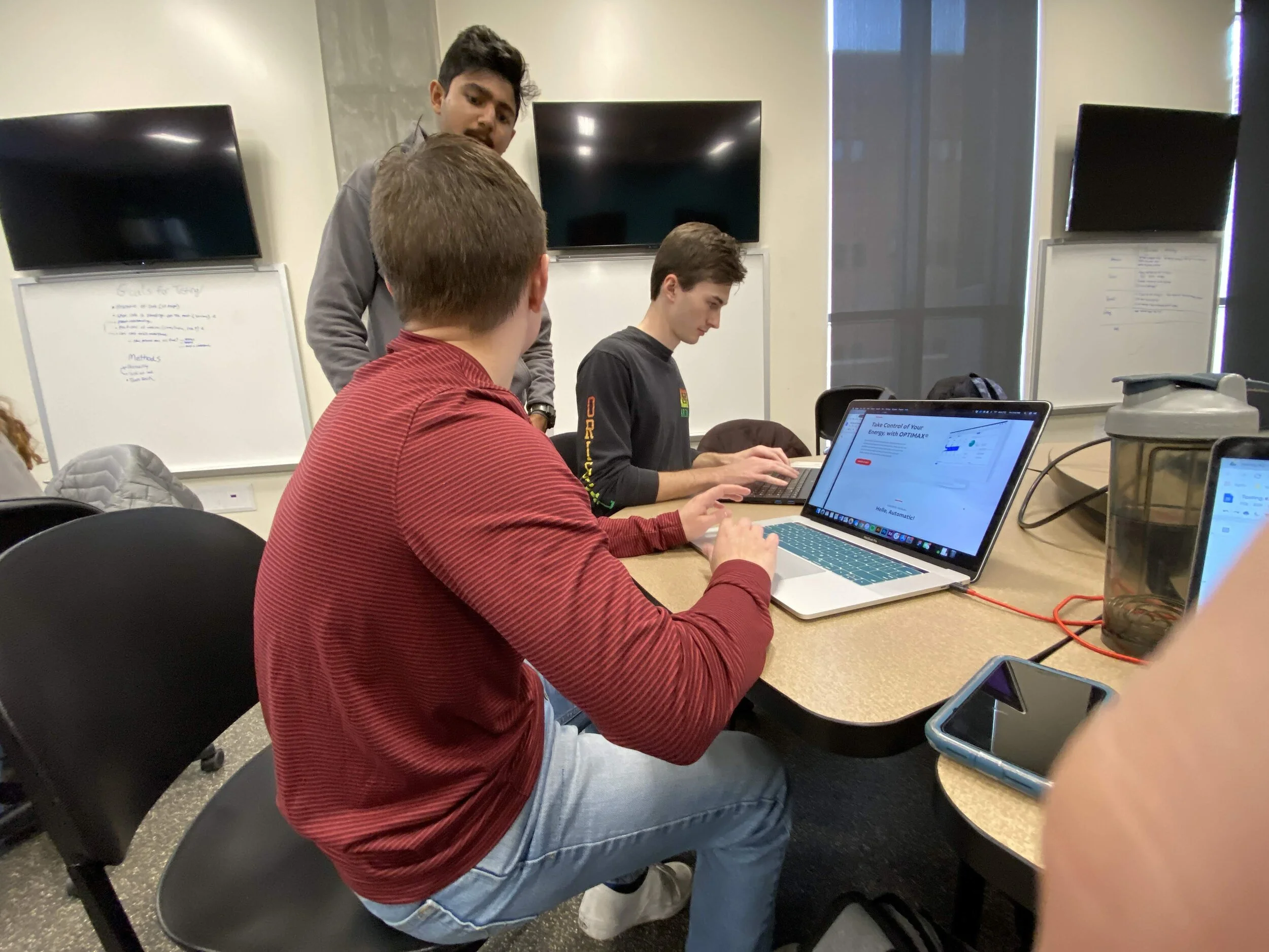
To test this, I had suggested we do teachback testing. The team agreed to the idea of teachback testing because it allowed us to understand if the the users retained the information presented to them as they had to teach it back to us. We had a think aloud phase before teachback to understand the participant's interpretation of the information presented to them.
We got some interesting insights from this phase of testing from the participants. There were some common trends in our participant's responses.
Hi-Fidelity & Testing Round 3
We created a high fidelity mock up in Figma which was interactive to address some of the points mentioned in our earlier testing. We made changes to the visual hierarchy so that information presented to the user stands out and helps with the understanding of the website.
The goal for this round of testing was to understand if the interactions we created for the website made sense to the users and if they were helping the customer journey. We also wanted to find the overall understanding of the user as they progress through the sections of the website.
To test this, I initiated to create a testing protocol. I created a test in which we measured user’s interpretation of their understanding of the website by using a understanding scale as they thought out loud through the prototype. We asked them to point their understanding after every section. The other part of the test was the user was asked to tell us what they expected would happen when they click something on the screen and then compare it to what actually happens. This was concluded by a session of teachback as they explained to us what they saw on the website.
This gave us some good insights and understanding of how well our customer journey is being understood by the users.


"We showed how they could tell the story, but they (ABB) have the story to tell."
We wanted to conclude our project in a "summarized" manner so I came up with this conclusion line which our team really liked and it became a part of our project documentation and concluding remark.


Reflection
This was a great project for me to work on as I was able to provide a great deal of input in our design decisions. I was able to learn a lot through the project. I haven’t been very keen on research but this project had us doing a lot of research. I was able to learn about my strong suits when it comes to research and what doesn’t work too well with me. I found I was able to ask good questions throughout which tells me that I am able to ask the right questions which is an empowering feeling.
I wanted to master something of my interest and I feel like I got the opportunity to do do so with the testing in this project. This project helped me with gaining more clarity about what my capabilities are and what I would like to experience more. I was able to recognize flaws that I should work on such as being engaged in project phases I might not be immediately interested in. The project helped me grow as a designer and apply the learning I have gathered so far.
Asking ‘WHY’ at every decision we make in the design process had been something I have learned is a great strategy. The why tells me if the decision is going to bring value or just fill a criteria. And I have made strides towards doing honest work hence this helps a lot.
Concluding, I had a great time working on this project as a team member and as an implicit leader through phases of the project. I would love to get more opportunities moving forward and would like the opportunity to take over more responsibilities. I am looking forward to our next studio and next set of amazing challenges.
