Reserving Spaces at Purdue
Google Design Challenge 2021 | Interaction Design
Project Brief
”Your school wants to provide dedicated spaces for students to help them focus on their academic studies. Design an experience for students, professors, and members of the school community to reserve work desks/spaces in the library. Consider the experience of checking availability, reserving the space, and reporting any issues.”
Duration: 1 Week
Individual Project
Process Overview
My Design Solution
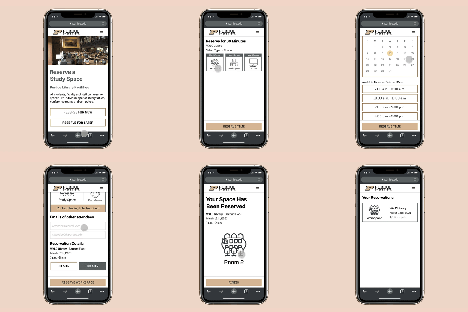
I created a mobile web experience to reserve spaces around Purdue’s campus.
It intends to provide the most efficient way to reserve a space at Purdue in following situations:
You are on campus and need a place immediately.
You are booking for later and ____
you know where you want to meet and want to browse availability
you know when you need to meet and want to find spaces for then
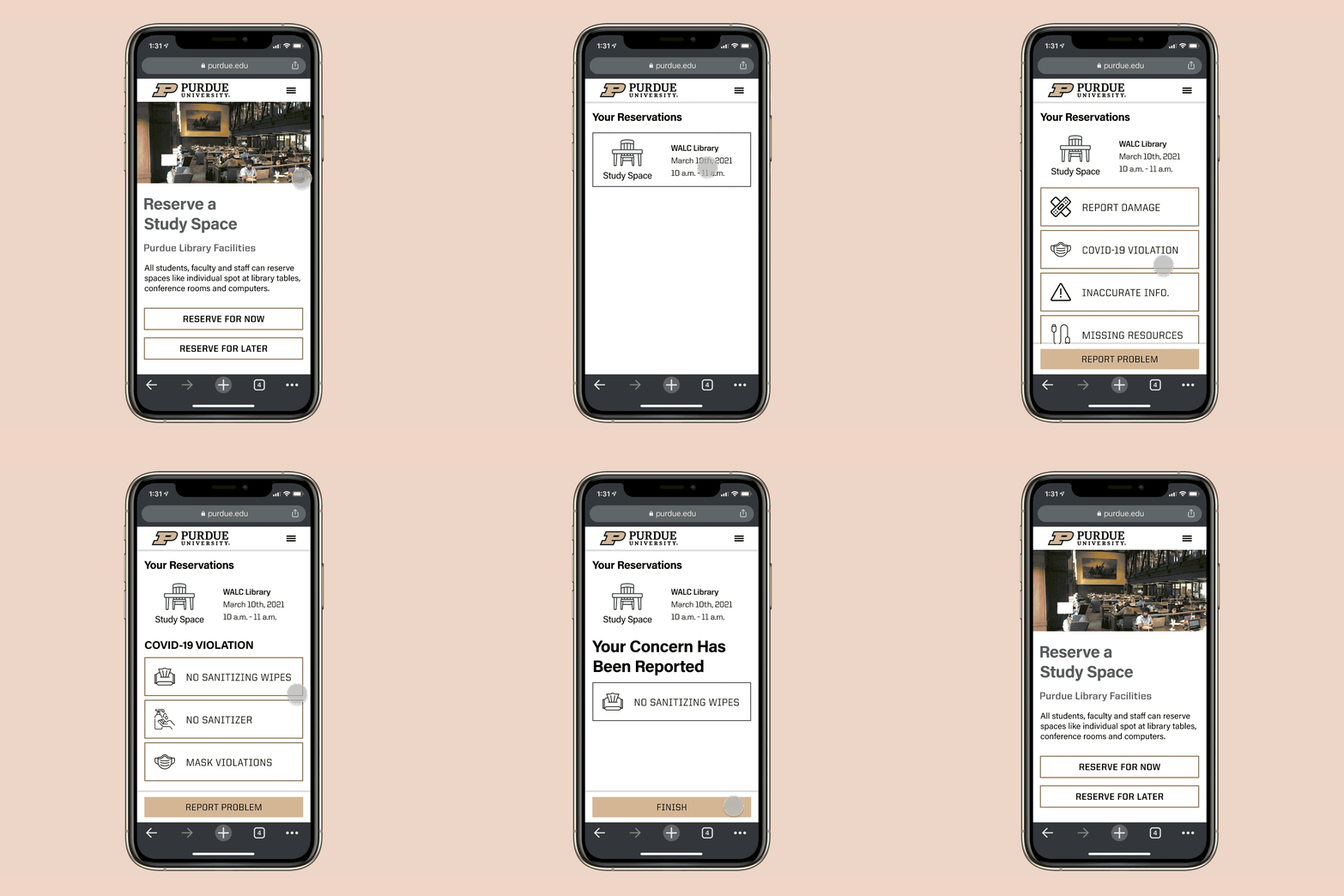
Need to report an issue.
I considered the challenges that COVID-19 brings to the design space.


Mind Mapping
The first thing I did starting off on the project, I kind of put all my thoughts out in form of a mind map of the associations I was making as I read the project brief.
Secondary Research
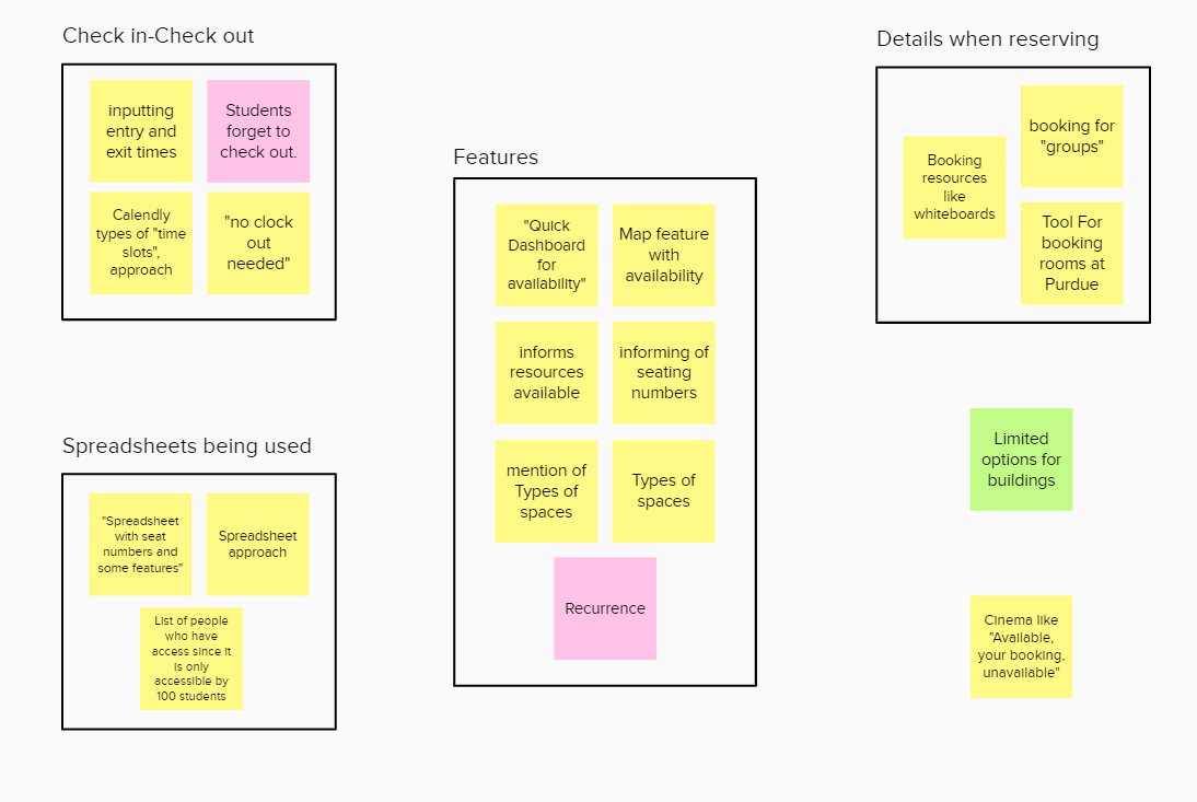
I chose to look into what kinds of solutions have universities across the world been using for similar situations. I looked at what Purdue has been doing for some exclusive spaces like the UX studio which few have access to. Following this I affinity diagrammed my findings.
Takeaways
Current solutions make use of spreadsheet like interfaces
Manually entering check in and check out time could cause errors
Seating space types and resources available valuable
“Primary Research”
I would have conducted interviews to recognize expectations of the users from the spaces they reserve, situations they find themselves booking spaces in etc. if I had more time but with the current timeline, I had to be creative.
As human centered designers, we either sympathize or ideally empathize with the users.
In this case, I have been in the position of the user and have kind of done unofficial and unintentional “contextual observations” when I have been with my peers who have tried to reserve spaces.
Ideation
My first thought was pretty obvious with a website to reserve spaces.
I thought about a kiosk which could be placed in the libraries.
I thought about a use case which included wearable tech like a smart watch to check in and check out.
I thought about a simple interaction on mobile to reserve a space. which I further iterated upon.
Iterated into Lo-Fi Prototypes
Upon iterating on my mobile idea, I fleshed out the wireframes and turned them into a lo-fi prototypes on Whimsical.
User Testing and iterating into high fidelity
Goals
Evaluate if users recognize and follow the task flow for the scenarios and recognize flaws in the task flow
Recognize Usability and Efficiency flaws
Methods
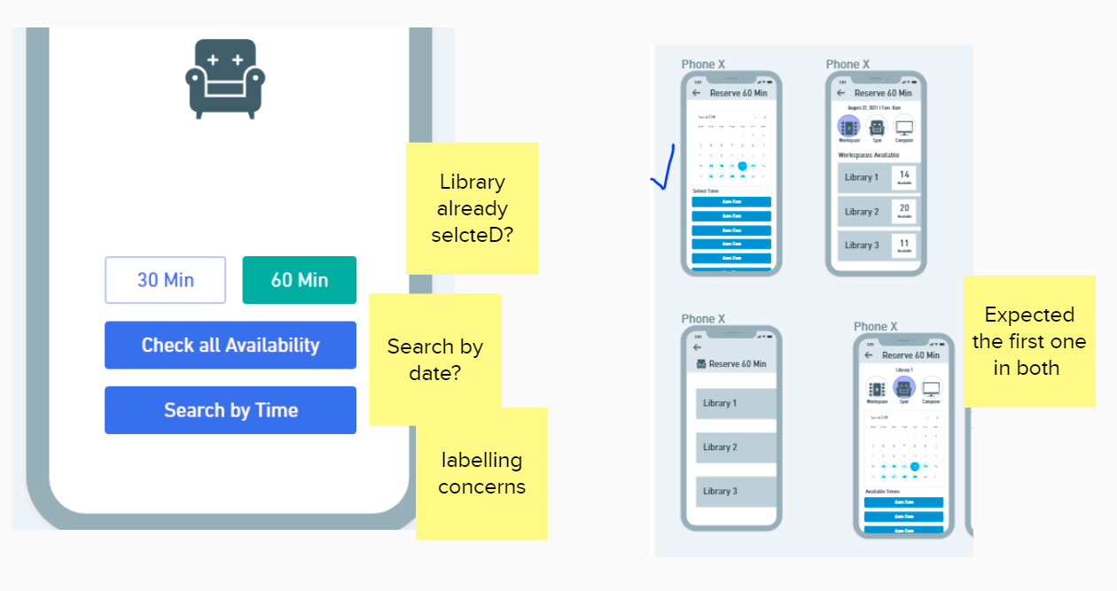
Conducted 2 tests walking users through the lo-fi prototypes and asking what they would expect to see upon performing certain interactions.
I also tested the basic usability of the prototypes.
Takeaways
Some issues with labels being confusing.
Some confusion on task flows when shown in parallel
Mood Boards and Branding for the Hi-Fi
I looked at reservation interfaces for arenas, airplanes, theatres and even Zipcar because it had a college context to it.
Since the project was supposed to be “for my school”, I decided to stay true to Purdue’s brand guide.
Purdue has a pretty detailed set of brand guidelines.
Final Prototypes and User Testing
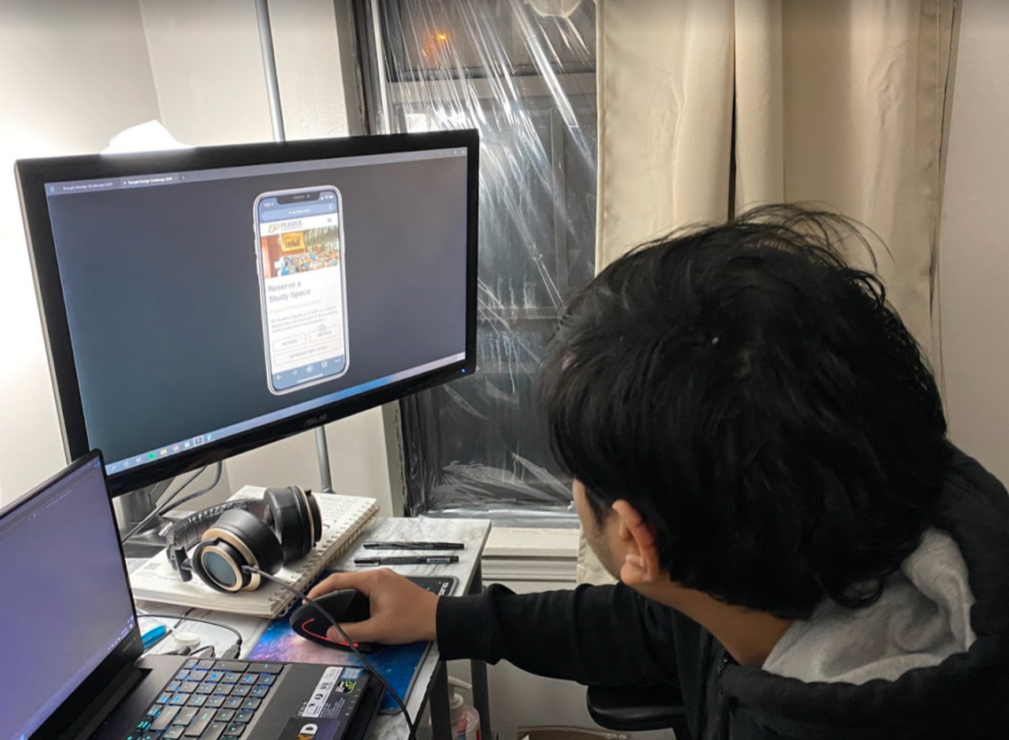
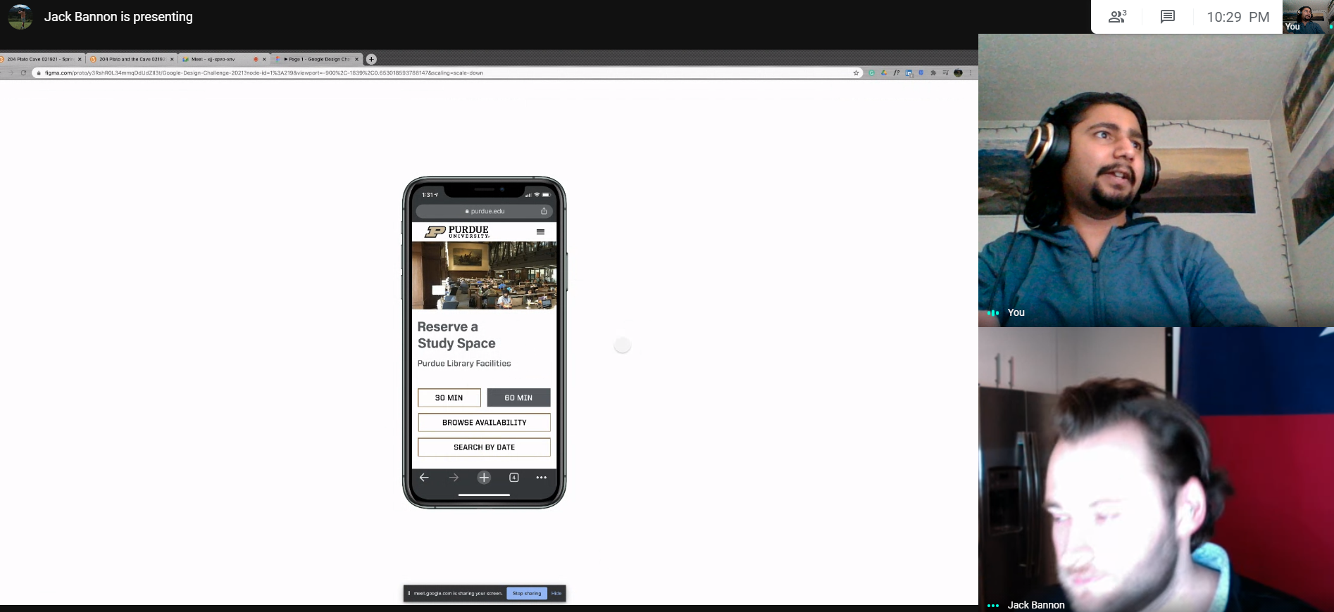
I created interactive high fidelity prototypes on Figma and I usability tested with three users to find any final flaws before concluding my work.
I found some minor necessary changes in captions and titles like making sure to say “times available on selected dates”.

Reflection and Next Steps
Receiving the challenge prompt on Friday night was a bit of a blessing and a curse, I took it positively and pretty much spend every living moment of the weekend working on this. I didn’t want to spend the week because I had a project due and some midterms. This is when I kind of got some experience on working on a time crunch.
I learned how to prioritize work like not doing primary research because it didn’t add enough value with the time I had. Kind of creating a MVP ended up being my final solution albeit in a high fidelity.
If I had more time to work on this, I would have liked to conduct some primary research to learn from the user’s perspective. Another thing I wish to have done was perhaps doing a more visually pleasing interface just for the sake of visual design.
All in all, I put in my best effort and hopefully it shows. 😄


