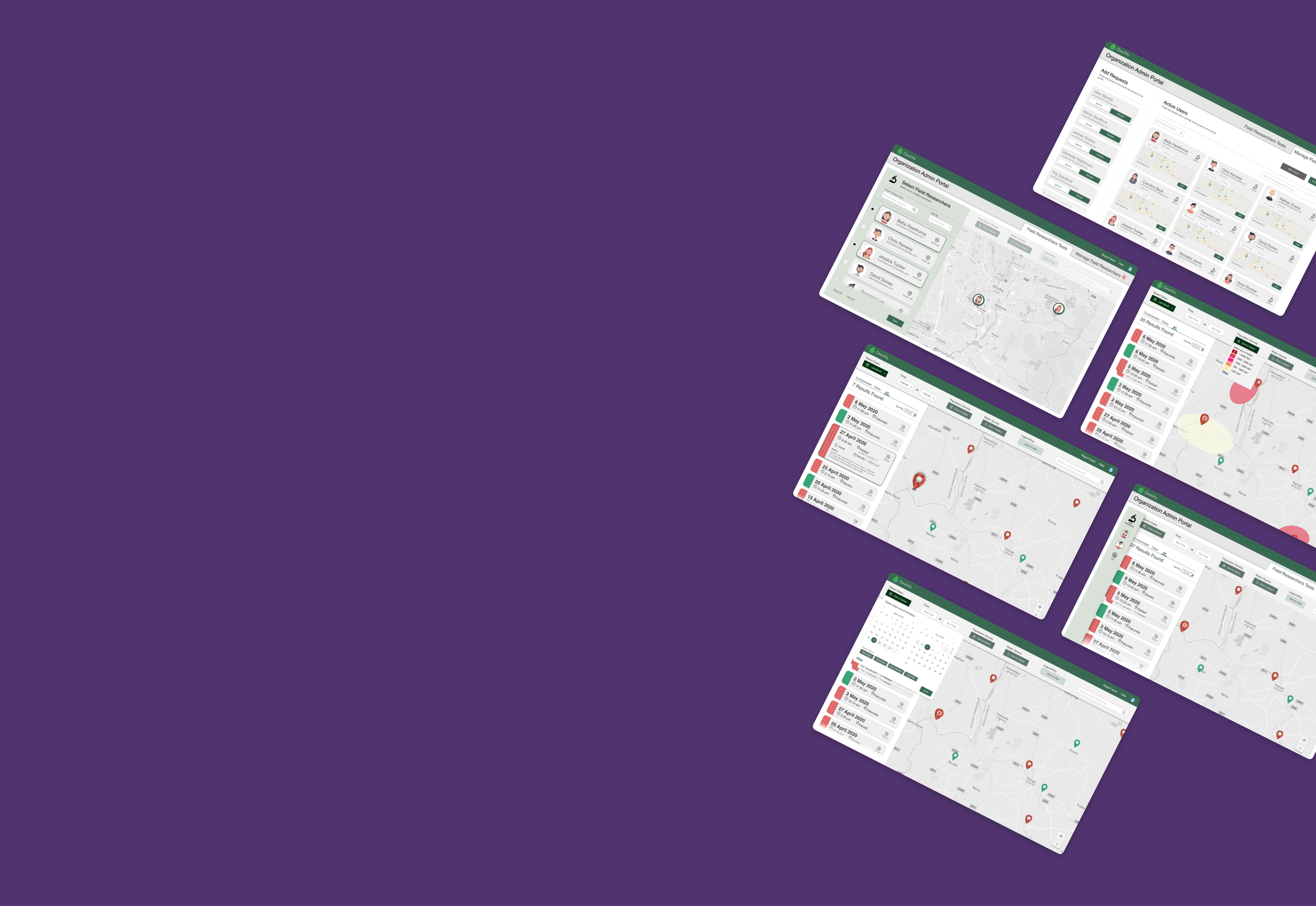
Redesigning OmniVis’ Cholera Test Data Portal
January 2020 - March 2020 | 12 Weeks | Industry Sponsored Class Project
Purdue’s UX program collaborates with industry partners on their projects, this project was for a Biotech company called OmniVis which is a biotech company which makes a handheld to rapidly detect for cholera in water samples.
CONTEXT
OmniVis had been using spreadsheets but with it expanding and partnering with not for profit organizations field researchers using their devices, they needed something comprehensive and elegant.
- Needed a portal for Field Researchers, Admins at not-for-profits orgs, and OmniVis Admins.
WHAT WE DID AND DELIVERED
The team researched to understand researcher needs, not-for-profit org admin needs, and admin needs. We went through three rounds of prototyping and testing in increasing fidelity for each user.
- Approached the problem one user at a time starting with the field researchers
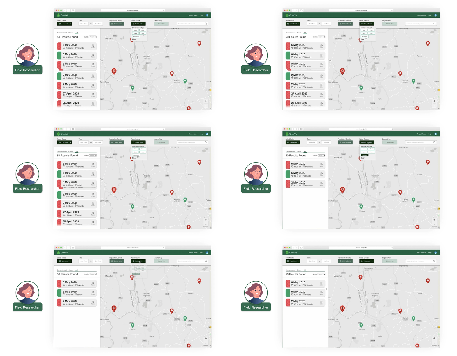
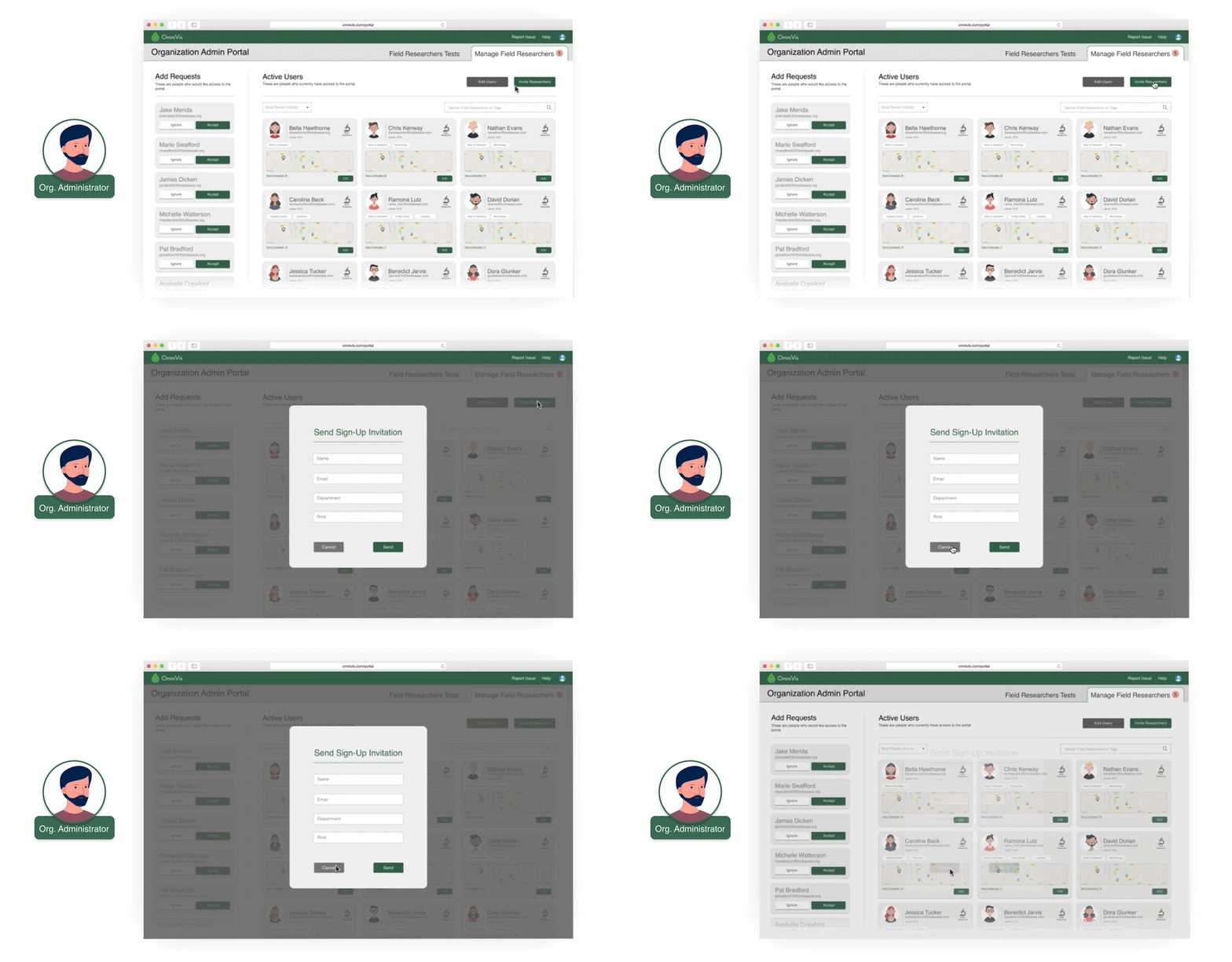
- Created interactive prototypes for the field researchers and Not-for-profit Org admins
CO-LEADING A TEAM OF 7 DESIGNERS - MY ROLE
Through the project, I led several meetings, interviews, testing sessions, etc. I put in high attention to detail and I mentored four freshmen through their first project.
- Created the majority of the high-fidelity prototypes
- Organized a work-session to introduce and introduced Figma to the team
- Introduced UI design practices, accessibility standards like AA/AAA compliance
Read more in detail and check out the prototypes below!

The Process
Three stakeholders: Field Researcher, Organizational Admin and System Admin
Researching what’s important for data portals in general?
We started the process with looking at other open data portals. We tried to understand what are the important qualities of comprehensive portals.
As a team lead, I explained to the team how we efficiently do a competitive analysis and affinity diagram it.We found the following being important:
Navigation: breadcrumbs, side/ top navigation
Sorting and Filtering: narrowing down the large lists
Scannability: finding the information quickly
Visualization: more intuitively understanding the data
What do Field Researcher’s need?
What can we make for them?
Interview with Sponsors
Goals: We wanted to know what a field researcher needs to see and why they use the portal.
We found out that number of tests conducted, time and date of the tests, test results and a map view of where the test were conducted were essentials for a field researcher.
Workflow and Initial Ideation
Workflow:
Login > see all tests > sort or search for tests.
Based on the understanding of needs and workflow, we started ideating on layouts for the field researcher.
We came up with some layouts but more importantly we now knew essential components for the design.
Expert Interview and Activity
We interviewed a field researcher (also a grad student), who has worked in the field to get insights on information hierarchy for the portal and understand overlap for org administrators.
We conducted an activity where cut-outs of our layout were provided for them to arrange in a way which made sense to them. We got insights on how well aligned our understanding is for the user group.
I led 1 interview and administered the rest 2 interviews, letting the team members take the lead. I provided questions in the backchannel during the interviews for the team to ask. During interviews (which were conducted remotely), I often white boarded notes and drew up relationships between the information we were gathering. This was my method of sense making as we got more information. The team liked this as it helped place the interview insights in perspective.Creating Low Fi prototypes and User Testing
Low Fidelity Prototypes
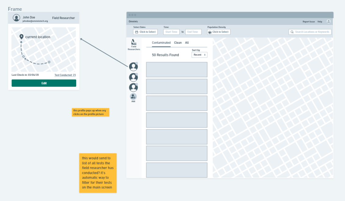
We created a layout based on our ideas in our previous round of ideation and based on our understanding from the expert interview and the layout activity we conducted with our expert. We created a layout which covered all the goals for the field researcher
Testing and Takeaways
Based on some usability tests and feedback from our class presentations we realized that we had not explored the space enough in our ideation in terms of the layout we had gone with. We found that:
We need to figure out more ways of how information can be filtered in our portal
We didn’t have enough design rationale for what we had come up with.
As a team lead, I set up and orchestrated the group ideation activity setting up a gallery walk where the team could leave thoughts and feedback on ideas on sticky notes. I conducted 3 tests with our initial prototypes.Comparative Research for Layout & Filtering Options
What we looked for
We started off looking for layouts which made use of cards and maps on the same screen.
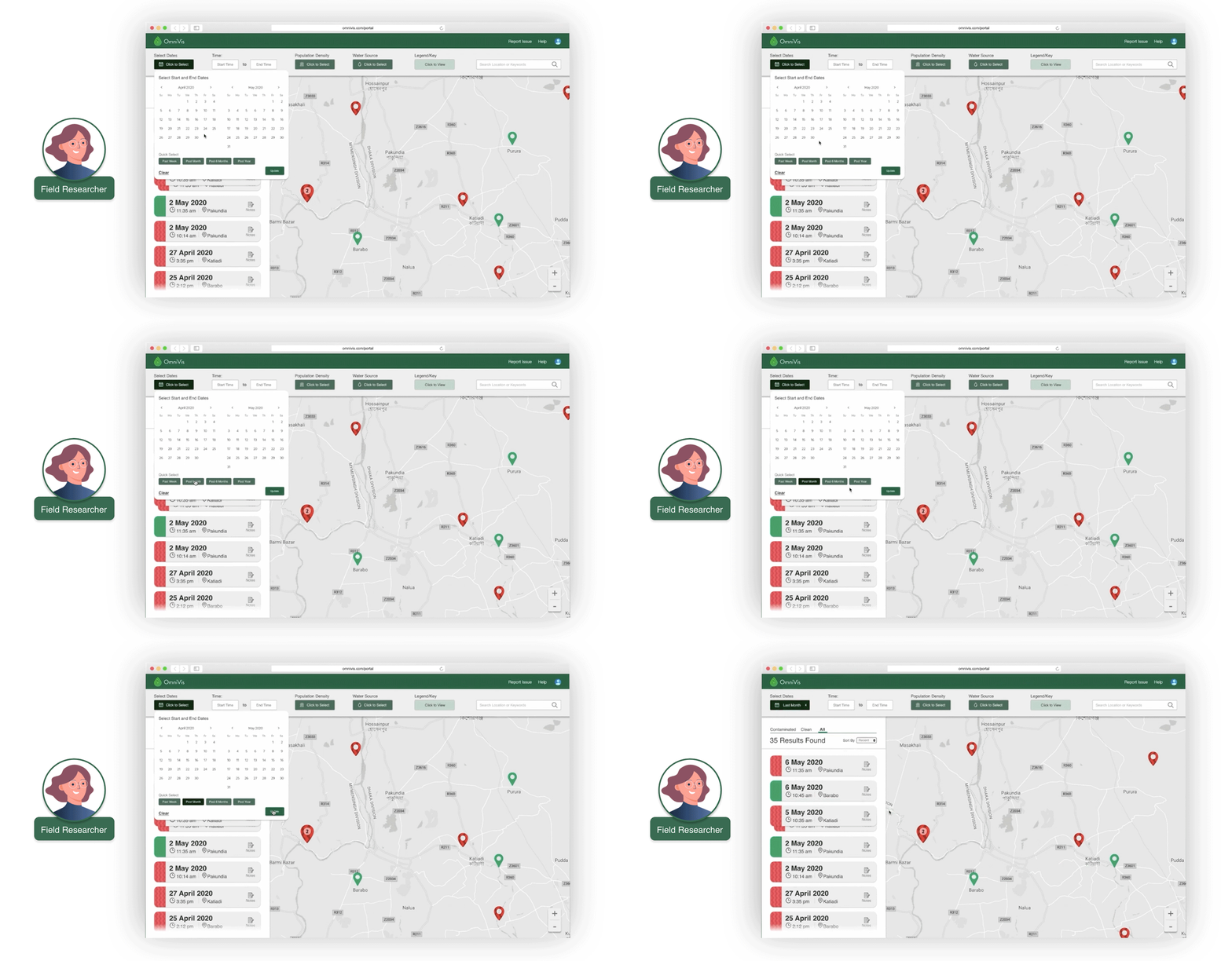
We also wanted to look into ways data on the portal would be filtered and sorted. by the field researcher.
What we found
We realized that a lot of “hotel booking” sites and apartment finding sites like Airbnb and apartments.com were using the same layout with cards on one side and map on the other.
We also found ways filtering has been displayed on various sites like amazon, audible, b&h, and Airbnb.
What we took away
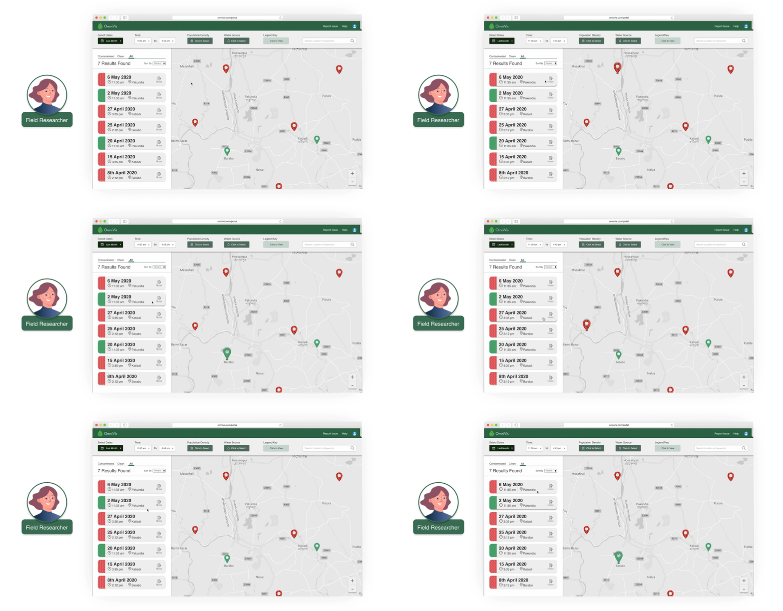
We had good reasoning to set on the left side card right side map layout and also got a fair few ideas for how we could filter the information on the portal. (visually)
We ended up using some UI ideas from Airbnb and Audible websites filtering options.
I discovered similarities between what we were looking for and apartment websites and hotel booking websites which led me to looking into Airbnb. This significantly influenced our design. I also found tabular switching from Amazon’s audible site which we used for our different result types. Transitioning to High Fidelity and Testing
What was changed?
We finalized our layout from a variety of options we had come up with on the basis of familiarity and easy of use.
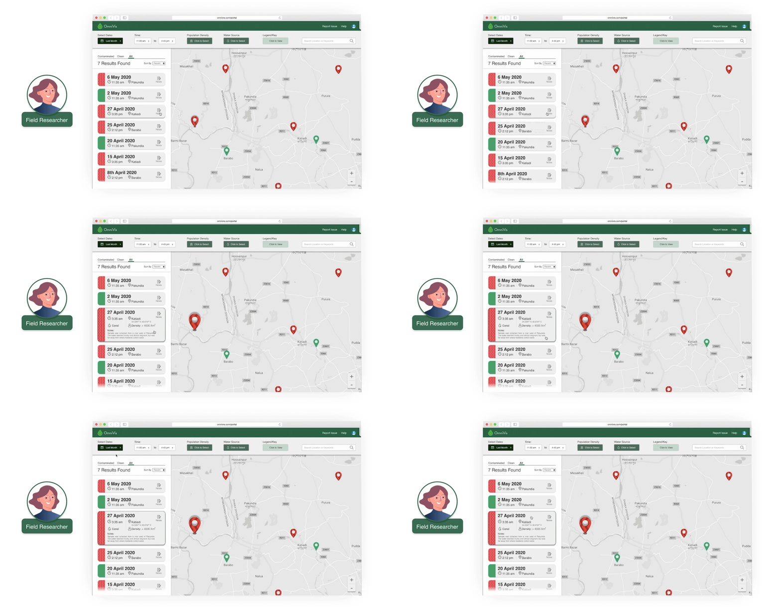
We worked our way through a medium fidelity prototype which upon testing we found had some accessibility flaws like our color choices didn’t take into account colorblindness. Upon coming to a final prototype, we tested again.
Test Takeaways
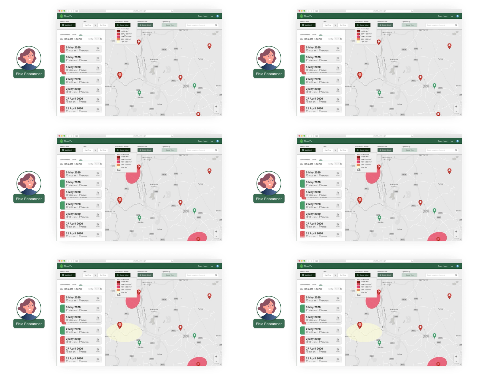
We found that we needed a key/legend for the map and a little bit more guidance for the users so they know what they can do with the portal. Upon discussing the second point with our sponsors, we concluded that concern will get addressed by as OmniVis would introduce the tool to the users and also the researchers are aware of their needs.
With this, we had our the final iterations and presented our final design.
I created most of the high fidelity prototypes from scratch. The team had done initial work in medium fidelity and I created interactive prototypes for our solution. I set up a color palette for our prototypes and used font and other brand guidelines provided to us by OmniVis. I created about 40 frames or screens on Figma (counting different states in interactivity).Transitioning our focus to
Organizational Administrators
Who are they?
The field researchers (our first user-group) work for various organizations. These organizations have people who manage the researchers out in the field. These people overlook the tests their researchers are conducting and are responsible to raise alarm if there’s an outbreak/ know or predict an outbreak based on the data. This is who we are calling organizational administrators or Org Admins.
Interview with an expert
The team at OmniVis connected us with an expert in the field who had been head of logistics, supply chains and lead researcher teams in the field at Papua New Guinea, Yemen and more. His perspective provided us some insights on what a org admin might want to know.
We learned about “where” the positive cases are and what water source they were from were very crucial in predicting outbreaks.
During the expert interview, I had to take over as the interviewer as the interview was going off the script and into topics the team did not expect. I came up with some follow up questions on the spot to be able to dive deeper in the expert’s experiences. Dealing with a sensitive subject like public health, I had to be sensitive about questions I could ask the expert. I created a mind map of the information the expert had shared with us.Interviews to Learn about Organization Administrators
Context
We interviewed Katherine Clayton (our sponsor) as she had taken that role of a Org Admin before with OmniVis sending in their own field researchers. We reached out to various other people taking on org admin roles but this was during the very early COVID 19 days so the responses we got were essentially them being too busy with COVID outbreak.
Takeaways
From the insights from our interview with the expert and then with our sponsor, we had just about enough to work with. We found that the org admins need:
Ability to quickly select specific researchers and see their work
Ability to add / remove researchers, promote researchers and learn more about researchers (kind of a quick bio/their field of expertise)
I asked additional off script questions as they came up during the interviews and worked with the team to analyze the information we had gathered through the interview.Inspiration and Ideation
Inspiration
With the functionality in mind, we started out with looking for what’s out there that’s similar. We liked how MS outlook has three columns and we liked “Blackboard” (LMS) which has a retractable tab which comes in from the left side.
Ideation
We considered a fair few ideas on how we can display the needed information, we had a list view idea which was essentially a continuation of the Field Researcher’s portal, a grid view and also an idea for an edit page which was essential.
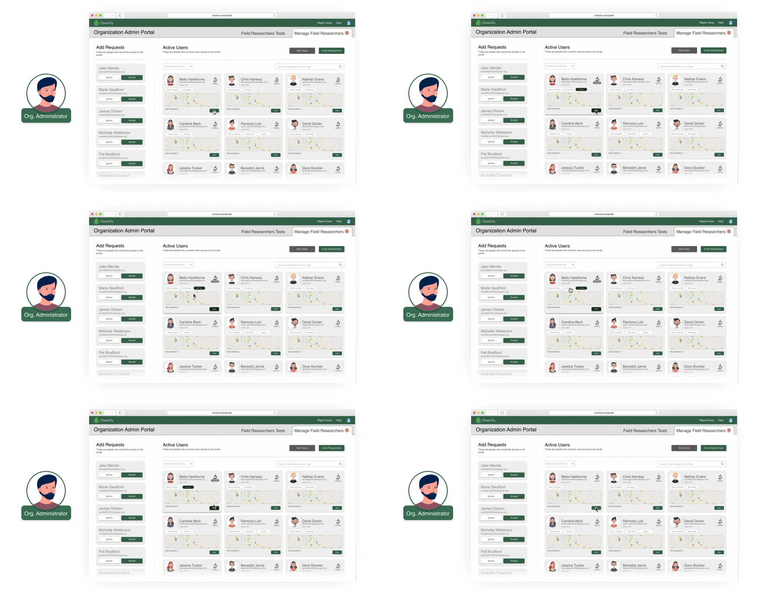
I introduced the idea for a hover interaction for the org admin (Robert) to quickly be able to see the researchers he has selected and remove researchers from his list of selected without having to go back to the main list.Creating Low Fi - Mix Fi Prototypes and Testing
Context
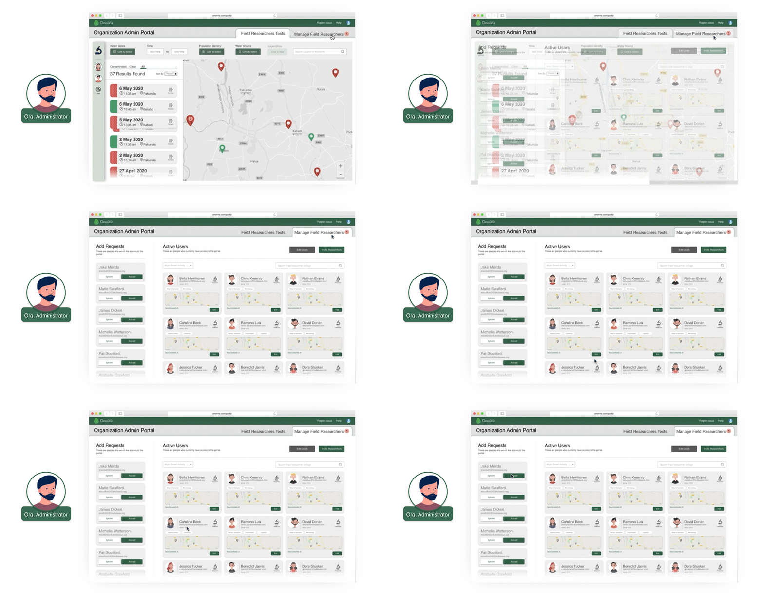
We initially tested our to find the most efficient layout (grid or list) and ended up with a hybrid with a expanding tab on the left side as it was found to be the perfect addition to the field researcher portal as it kept the design consistent and easy to use.
We created mixed fidelity prototypes as our final deliverable for this user-group as we were running short on time with the university transitioning to fully online. We tested and iterated till our final version.
Testing and Takeaways
We tested with about 6 people to try and see what issues come up. We found that the users were having a hard time figuring how to go back and choose different researchers.
We addressed these issues with use of better signifiers in terms of icons and text as well as added some micro-interactions to help drive the point home. We also created a page where org admins can see all about their researchers and add/remove them from the organization’s portal.
At this point, being completely remote with covid, I conducted 3 remote tests on our prototypes. I created the interactive high fidelity screens for this side of the portal adding up to about 20 screens on Figma. This was fewer because this side of the portal built up on the field researcher portal.Transitioning to System Administrator
With the two main user groups who are involved in the field research done, we moved on to System Administrator who would be the team at OmniVis. This user group was slightly disconnected with the rest two, They are responsible for:
Ensuring Smooth Functioning of the portal
Checking through the data that comes in for any errors
Managing users and organizations in the portal.
Research and Challenges
Research
Upon once again interviewing our sponsors since they would be the actual users of this side of the portal, we discovered that the System Admin side of the portal had a ton of functionality.
Providing a quick overview of data and ability to monitor trends
Troubleshooting if there are any issues in the data or the portal
Managing various organizations and their users.
Challenge faced
We were working under the assumption that System Admin side of the portal would just have a few more features than the Org Admin and we didn’t have enough time left in our project cycle to dive deep in the needs and wants this user-group.
Based on suggestions from our Professors and our team as a whole, we decided to provide OmniVis with suggestions or recommendations for this side of the portal and not push out a hi-fi prototype just for the sake of it.
Final suggestions for System Administrators
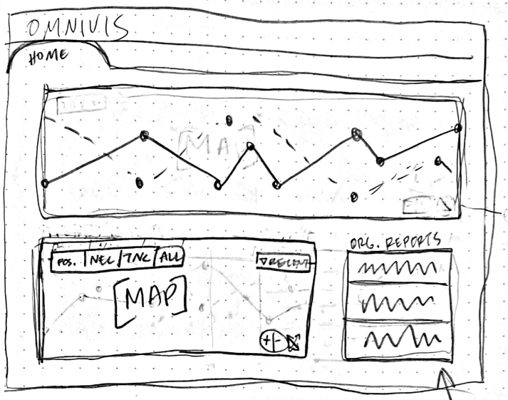
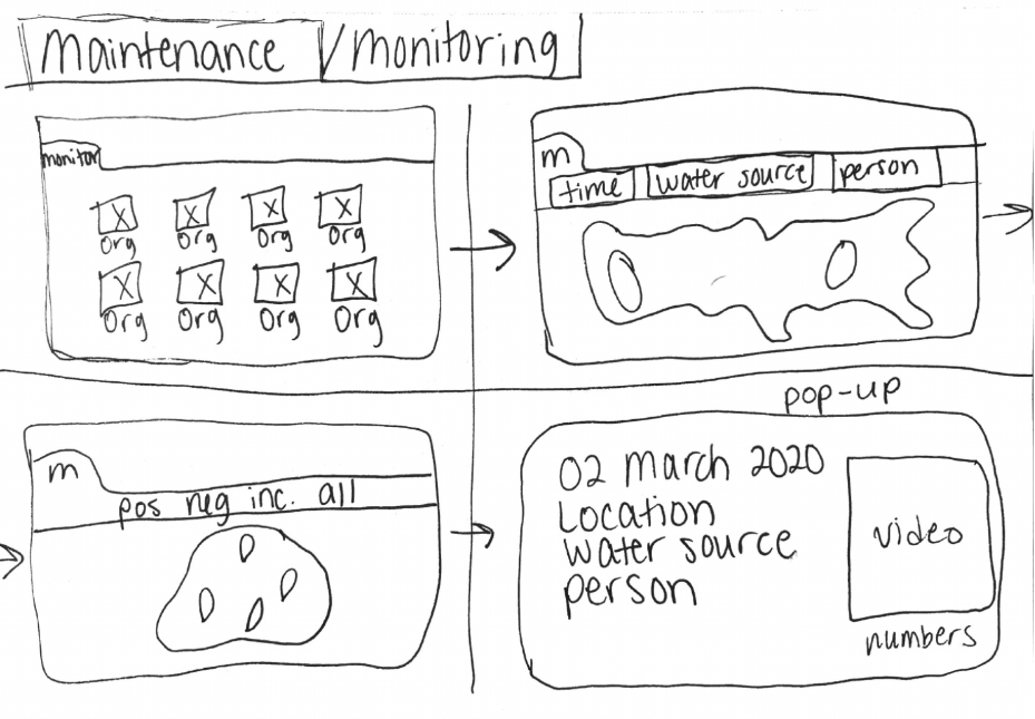
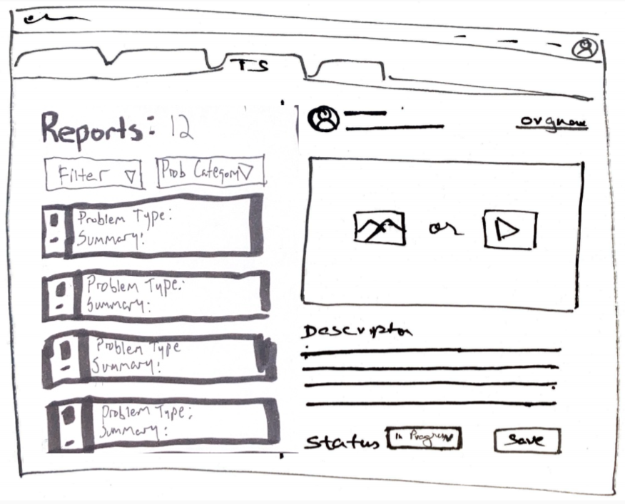
Following were some sketched out suggestions based on the interview we had conducted and some initial research into the user group. We sketched a “tab based” UI with notifications to enable system admins to hop between functionality for the different roles they have. A home page tab with overview, a maintenance tab, a Troubleshooting tab and a management tab was what we came up with.
Feedback from OmniVis
Being a Mentor and a Leader
With this project, being a Team Lead came with the responsibilities of being a mentor to the four underclassmen (freshmen) who were embarking on their first journey as a designer during our program at Purdue. I was in their shoes just a year ago and remembered well what my peers and I were going through. With the help of my co-lead Eleanor Hamilton, we came up with a program to check in with our freshmen every other week on a personal level and see what they were going through and what concerns they had. Also every week we started of with a bit of a group reflection on the past week and what we looked forward to.
For me individually, I was able to connect well with the underclassmen and was able to encourage them to try out every experience possible and see what they found the most rewarding. As one of the leaders of the team I tried to create a sense of importance for attention to detail as I led by example. It did take a few weeks for the underclassmen to get comfortable as I initially came across more authoritarian than helpful. I made adjustments to my style of leadership and allowed the underclassmen to take the lead.
In the end we were able to work very well together as a team and we saw quite a growth in our freshmen’s ability to work and lead. One of our freshmen got the opportunity to be a team lead in the next semester which is an example of our success as mentors!
Reflection and COVID-19
This was a weird semester to work on a project which dealt with disease outbreaks. We were in the middle of the project cycle when COVID-19 became rather prevalent and ultimately ended up turning our very hands on in person program into a distance learning program. It was a blow to us as students but to me it was an even significant one given my peers are essentially my family here at Purdue.
Being able to work through the pandemic and be able to produce the results we did as well as find our sponsors being pleased with what we created gives me a lot to be pleased about. As a leader I was able to make sure we did good work and we did. I couldn’t ask for more. As we wrapped up the project we realized how much of an impact our design will be making in the field making life easy for people who literally save lives.
I got a lot out of the experience being an integral part of essentially every significant decision made on this project and being able to leave my stamp on it as I worked a lot personally on the final deliverables (interactive prototypes) which was something I was interested in doing. As well as the experience of being a leader and mentor was quite rewarding.


